Martin Christie - Colourfast Group
As promised this month I will concentrate on some basics in Photoshop for printing for those who are just starting this adventure as I did twenty years ago, and in following columns lead you through things I have learned along the way. There are a number of other applications you can use for image editing but Adobe’s prime app is still the industry and much copied by others for its continued development as the rapid advance of artificial intelligence takes hold of so many areas of our information exchange. There may be others that are cheaper, easier to use, and even some that do some things better, but overall Photoshop the most comprehensive tool for digital manipulation, and most importantly is continuing to develop due to the experience of its massive user base worldwide.
What sets it apart from most of the AI powered apps which most people - most of your customers at least - will be using is that as well as engaging all the electronic wizardry there is still a large element of manual input should you choose to use it. And that is the key for the professional rather than the convenience user. Although at times in recent columns I may have sounded like a one-man campaign against it, it is not the use of AI I caution against, but the misuse and lack of understanding of it. When it becomes all too easy to press a button rather than learn anything new, it’s a journey that leads into a cul-de-sac.
Recently when I saw an advert for software that ‘edits just like you’ that mistaken direction was very clear - I don’t want to edit just like I’ve always done, I want to learn and move on. During lockdown, when opportunities for shooting were limited, I dug into my archives and edited anew photos taken over ten years ago, and the difference is staggering. Things I thought were smart then look painfully clumsy today. Perhaps it will be the same with much of AI currently invading all our screens once the novelty has worn off.
I have used Photoshop from the beginning, and in fact during a visit to Adobe’s London HQ a few years back, the enthusiastic millennials that work there were astonished to learn I had started with version 4.5. To them I might as well have been studying ancient history. But the continuity is important because although that was by no means the first version, it was a generation that saw the programme start to stretch its legs and become a seriously useful tool rather than a simple function to open digital image files.
The great leap was the introduction of layers. Previously any editing involved work on the actual file, and any changes could not always be reversed which is why they are described as destructive. Layers allowed the non-destructive process by applying a duplicate immediately above the original so that transformations could be compared, controlled and if necessary reversed. So that is the first important lesson - the use of layers. If you are adding text then the layer is applied automatically as text, like many shapes, are initially not pixel dependent files so they can be made any size without altering resolution. Only when they are rasterised - made solid dots if you like - do they become a fixed size. This can be handy if a customer gives you a layered file with a font you don’t have. You may not be able to add to it or edit it but at least you can fix it without changing the type.
The basic workspace has remained essentially the same throughout the various versions of Photoshop, with the original tools in the same place on the top bar, even if their functions have expanded. This is much like a car which has the steering wheel and the basic pedals in the same place as previous models did 40 years ago. Much of the changes and all the fancy new stuff has gone on under the bonnet! More of that later. The first thing to know is that apart from the items that are fixed on the dashboard, almost everything can be customised to suit you so that panels you don’t use can be hidden and ones you like can be fixed so they are always there.
With limited space here I’m not going to run into detail as all the tips are already at your fingertips, just hover over Help at the end of the top line and ask the question. How to use tips are also available automatically if you hesitate with your cursor over any of the tools.
The first stop is to set your performance and appearance preferences. These are found under Edit > Preferences and Colour Settings. Make sure you can maximise performance with available RAM, and enough room on your scratch discs on the best available hard drive. Colour settings are set to American ones by default so you may prefer to set them to your own choices, and again your pointer will guide you through the options. Also check that Photoshop will recognise any saved colour profile in a new file and ask you whether you want to use it or not. This is sometimes a clue as to whether a customer knows what they are doing, and at least gives you a plausible answer if they query the colour they think they’ve saved. Back at the top line under View you have the option of setting your display to RGB, CMYK or any monitor profile you have calibrated so that you can match what you see to what you print.
If you have a dual screen set up, you can move all the panels over to the second one to give you more viewing space, and even use the Preview panel in Navigator to give you an enlarged real time view of any image you are working on. Sorting out your favourite working space is a great time saver as you get to know where everything is, and because you can create it as a custom option, if you are hopping from one computer to another in the studio, you can just dial in your own preferred control panel instead of floundering with someonelse’s.
As we often end up with multiple images open at the same time, rather than minimise them, where you lose the visual reference, you can tile them, have them floating or display up to six at once which can be handy if you are copying one image into another. You can simply drag one onto another. Remember though that Photoshop is pixel dependent taking the resolution from the base file, so if you drag one with more pixel dimensions it will land larger than the original might have been on its own and vice versa, so make sure you keep an eye on the scale tool indicator.
I always have the rulers option available which is particularly useful for large format printing where images don’t always conform to standard shapes and sizes, but one really useful tip is hidden down in the bottom left corner where you have the option to display actual file dimensions and resolution among other details. This saves you going back up to the top and opening Image Size just to check measurement. Anything that distracts you, even for a moment and interrupts the workflow can cause a mistake, and even a small one wastes time and paper somewhere along the line. So being familiar and comfortable with your workstation is as important as experience.
For those with experience, thank you for bearing with me, and do indulge me as even after 20 years I find I learn something new almost every day. Like most of us being self taught, it is always possible to miss something simple along the way, so no harm in visiting the basics particularly if you find yourself tutoring a new member of staff. Most training is inevitably on the hoof as few companies these days have the spare resources to invest in a specialist education programme for printing that takes someone off the production line. Besides it’s often that very on the job experience that gives a real grounding in the more practical aspects, particularly problem solving. How do you prepare for something when you never know what is going to come over the counter, or pop out of the email? Taking a good look at best practice from time to time does no harm rather than assume the way you’ve always done it is the best way.
Adobe is also always adding new features as well as fixes when it does its updates, and some of them slip under the radar as they prefer to headline some of the more eye-catching items that are sometimes a little more gloss than substance. Inevitably a little bit of a fancy gimmick is easier to market than something simply useful and rather boring to the average consumer. But it could be a potential game changer to us, and I have a couple in my bag. Sorting out which is more useful in our working environment is what I shall try and catalogue in this and future columns, but arranging the basic work place is the base line.
As mentioned earlier, all the basic top line functions remain the same in versions of Photoshop, but when you tap on Edit - Image - Layer etc it now opens a much longer list of options, and to be honest a good number I have never even used. Often they do the same job or similar to another function but just in a different way, so it may be a matter of which method you prefer.
Adobe actually say there is no absolute right and wrong way of doing something, just alternatives.
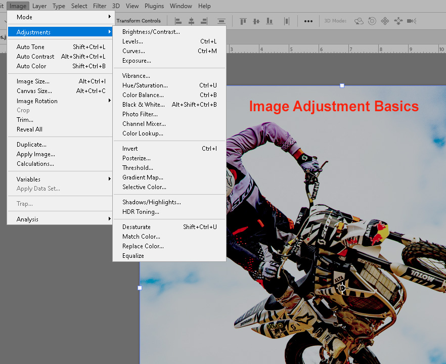
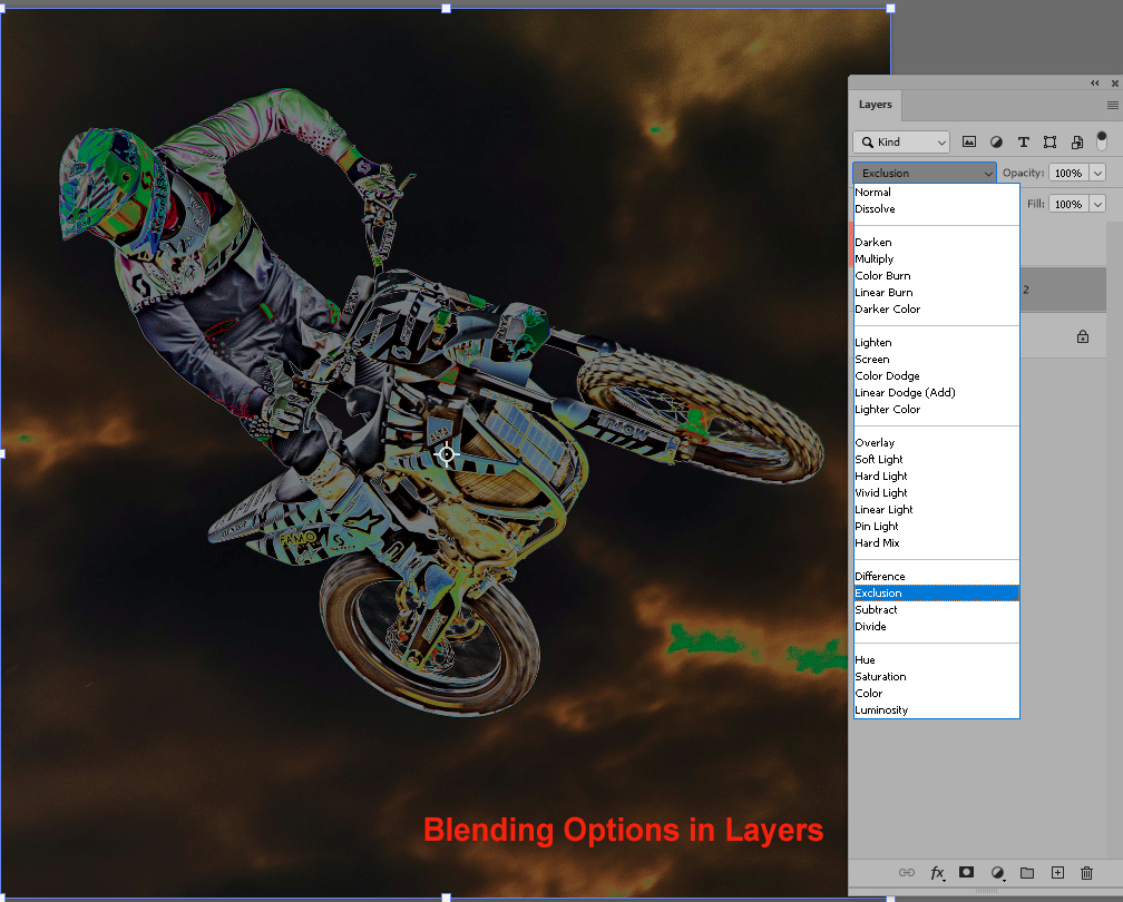
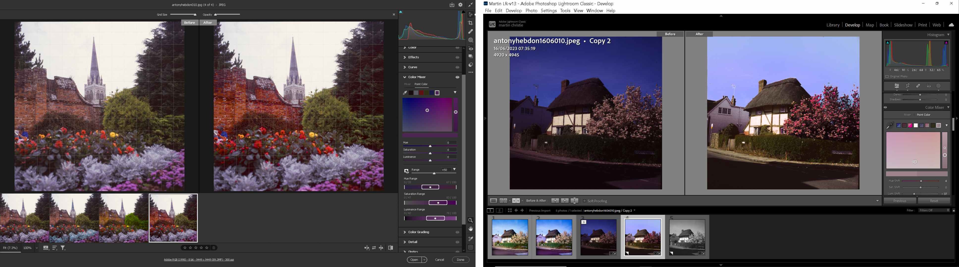
At its most basic you’ve got, under Image, all the simple adjustments that have always been available - levels, curves, exposure etc - and when these are combined with the use of Layers they can be very powerful. Not only can they be adjusted, but an individual level containing them can be controlled both on actual opacity of the effect, but with a selection of blending options such as Screen and Multiply which affect just the white content or the black content. This is quite useful for correcting one of the most common problems in customer files now where they have photographed or scanned a white background or document that as a result is under or over exposed.
Of course these are just Photoshop’s nursery slopes, but you need to be familiar with them, and how they work before we move onto the steeper climbs of the Camera Raw Filter. This hidden treasure is possibly the most powerful feature in modern digital imaging and least understood as it was originally developed for the use of photographers using a file format unprocessed by the camera, unlike the more popular Jpeg. It can be used however with any pixel based file and open a whole new world of possibilities. As we spend a lot of time making some very average or worse look good in print, it’s exactly the help we need.
Next month find out why.


.jpg)